
Customers experience one brand even when the journey moves between storefront, checkout and account areas. Sudden changes in tone, typography or information hierarchy can make a legitimate transition feel unfamiliar.
Consistency does not mean making every surface identical. Checkout has a focused payment task, while customer accounts support repeat service. The shared system should provide recognition without ignoring those different jobs.
Start with core brand signals: logo use, colour, type, spacing, imagery and voice. Decide which are essential for recognition and which can flex around the platform.
Review real journeys rather than isolated screens. The handoff between surfaces is where inconsistency becomes most noticeable.
Define tokens and patterns for headings, body copy, buttons, form labels, errors and reassurance. These shared decisions make extensions and future changes easier to evaluate.
Use colour with restraint in transactional areas. Contrast, focus and error communication are more important than reproducing every campaign treatment.
Set tone-of-voice rules for instructions, validation and confirmation. Operational copy should feel like the same brand while remaining direct and useful.
Document responsive behaviour and long-content cases. Addresses, company names and translated copy quickly expose fragile layouts.
Checkout should reduce distraction and make cost, delivery and payment decisions clear. Brand expression should reinforce trust without competing with the primary task.
Customer accounts can support more navigation, education and service content. Use that flexibility to help customers manage orders and relationships, not to recreate the homepage.
Extensions should feel native to the surrounding experience. Match spacing, labels and interaction patterns so custom functionality does not look bolted on.
Keep a strong default for unsupported or loading states. Consistency includes what customers see when data is incomplete.
Check the transition into checkout, payment errors, order confirmation, sign-in and returns. These moments combine high intent with high sensitivity.
Keep order details and product choices visible where customers expect them. Familiar information reassures more effectively than decorative security claims.
Make support routes clear without pulling attention away from completion. Customers should know help is available when something goes wrong.
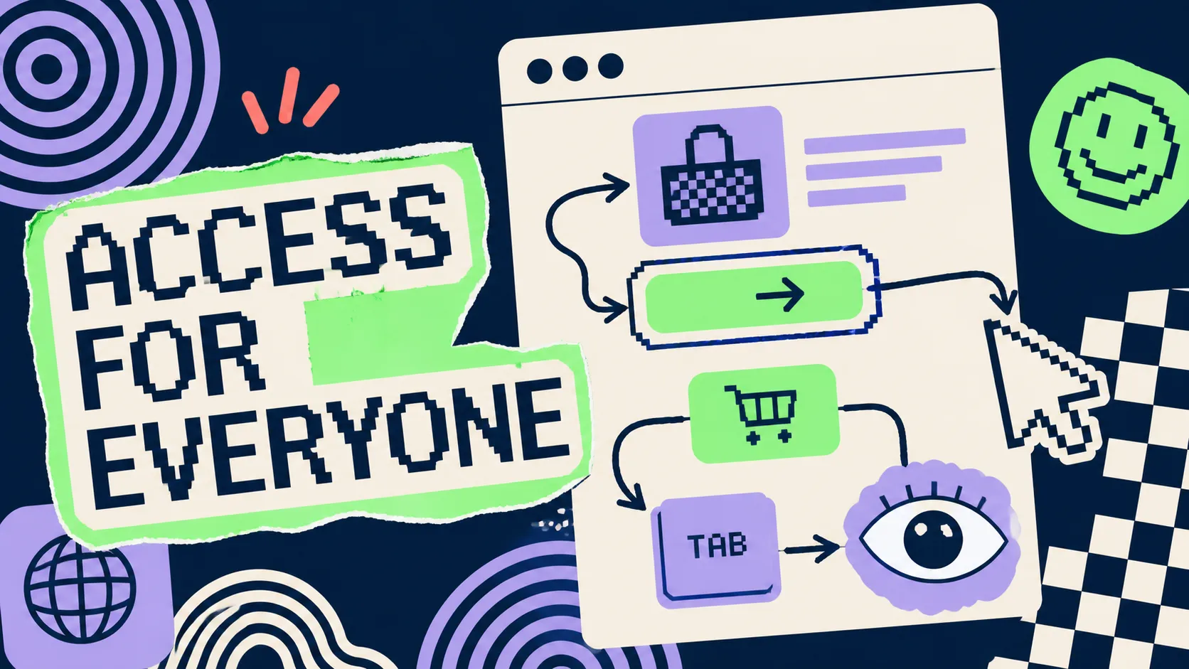
Test accessibility across every surface. A visually consistent journey is not coherent if keyboard, screen-reader or zoom behaviour changes unpredictably.
Assign ownership across design, development, ecommerce and service teams. Platform areas often drift because each is changed by a different group.
Review the journey after platform updates and extension releases. Shared tokens reduce work, but they do not replace end-to-end quality checks.
Use customer feedback and completion data to identify where inconsistency creates doubt. Avoid changing transactional interfaces simply to make them more expressive.
Strong Shopify Plus branding feels dependable. Customers recognise the business, understand each task and move between storefront, checkout and account without unnecessary cognitive friction.