
Making a considered purchase easier to explore online
Pod Space designs and manufactures premium modular buildings for homes and commercial environments. The website has to do more than display attractive photography. It must help customers understand the range, compare possibilities and decide whether a product could suit their site and plans.
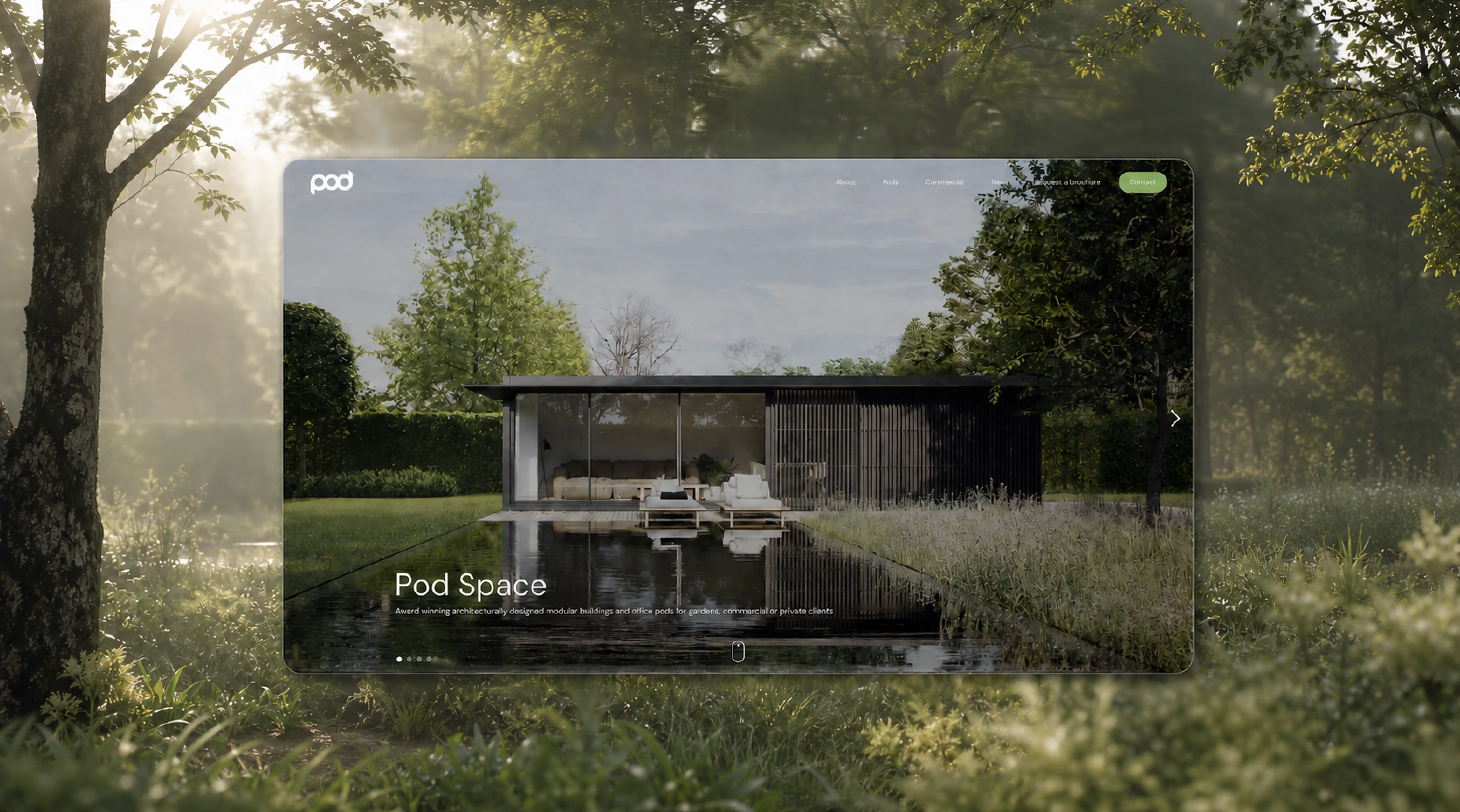
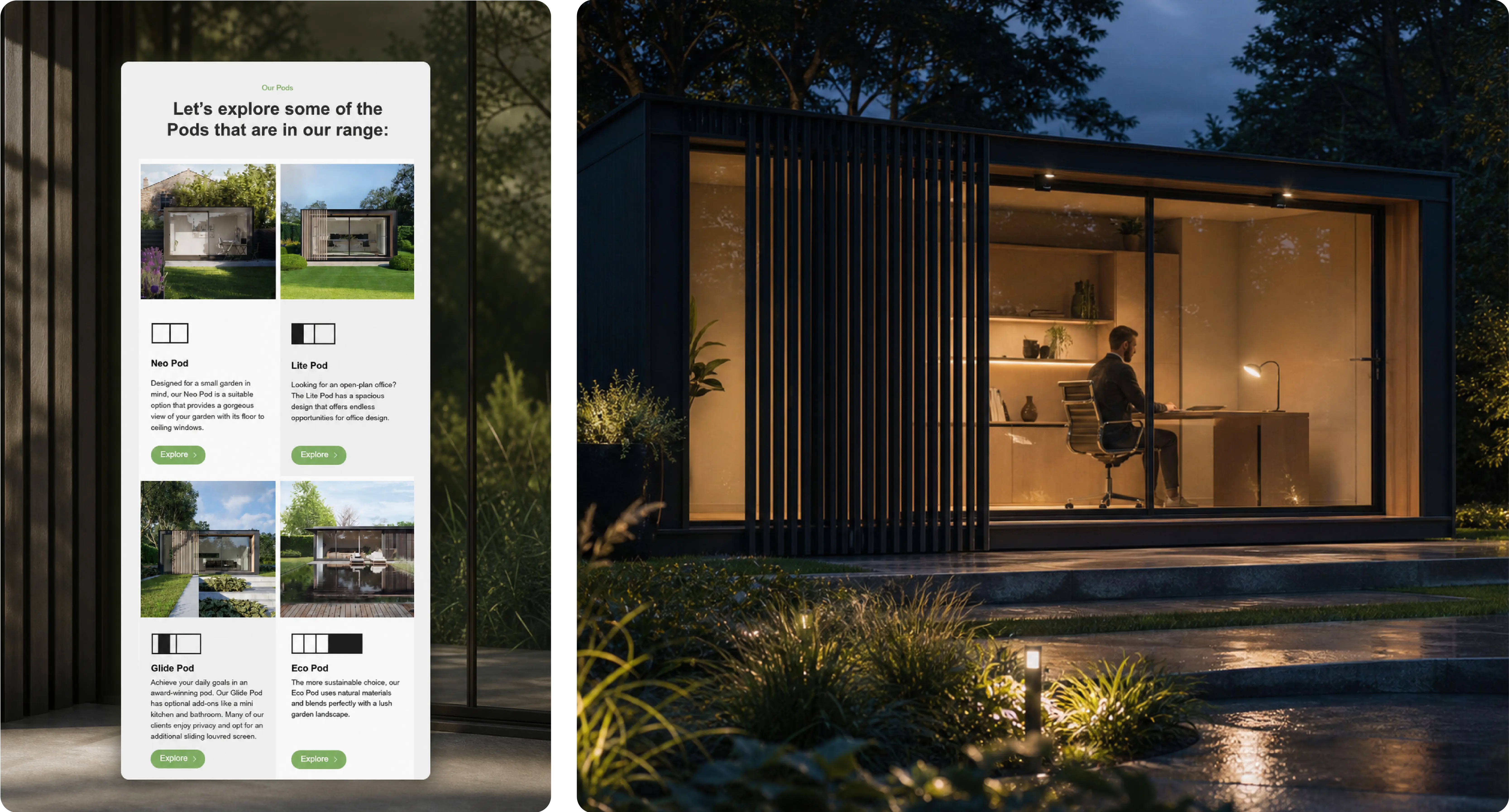
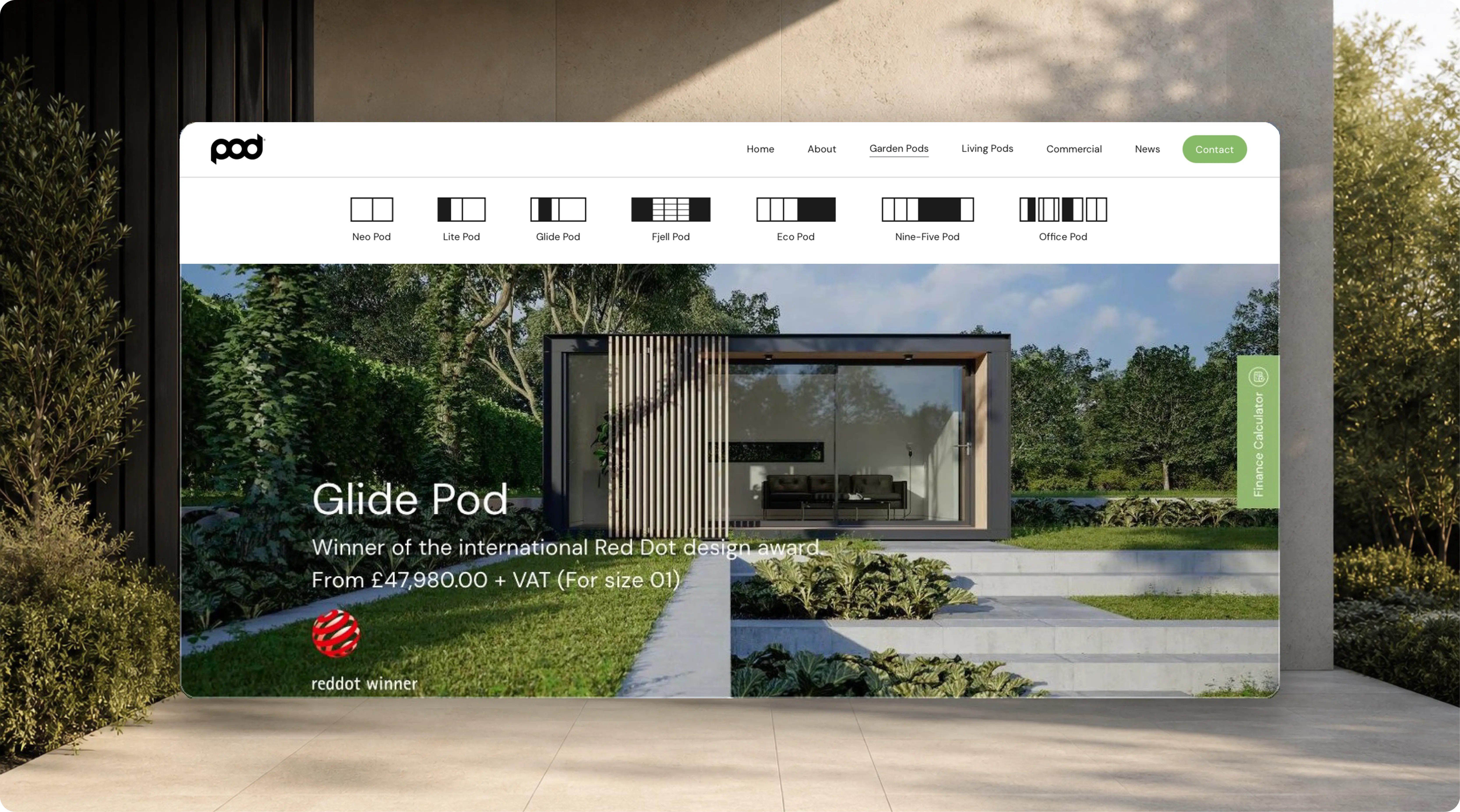
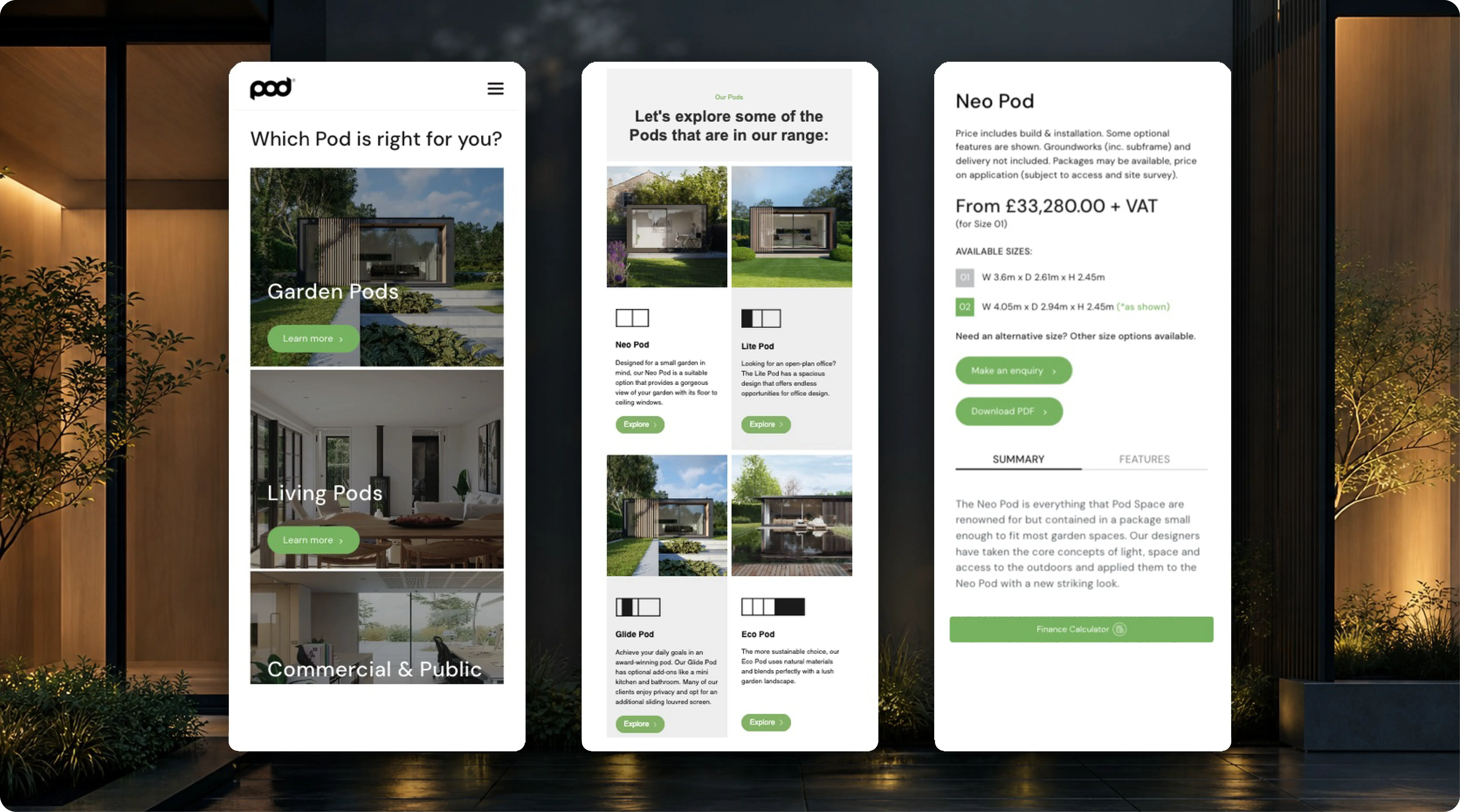
We migrated the website to Webflow and reorganised the experience around clearer product discovery. The website, mobile and architectural imagery shows how strong visual inspiration is balanced with useful product categories, specifications and calls to action.
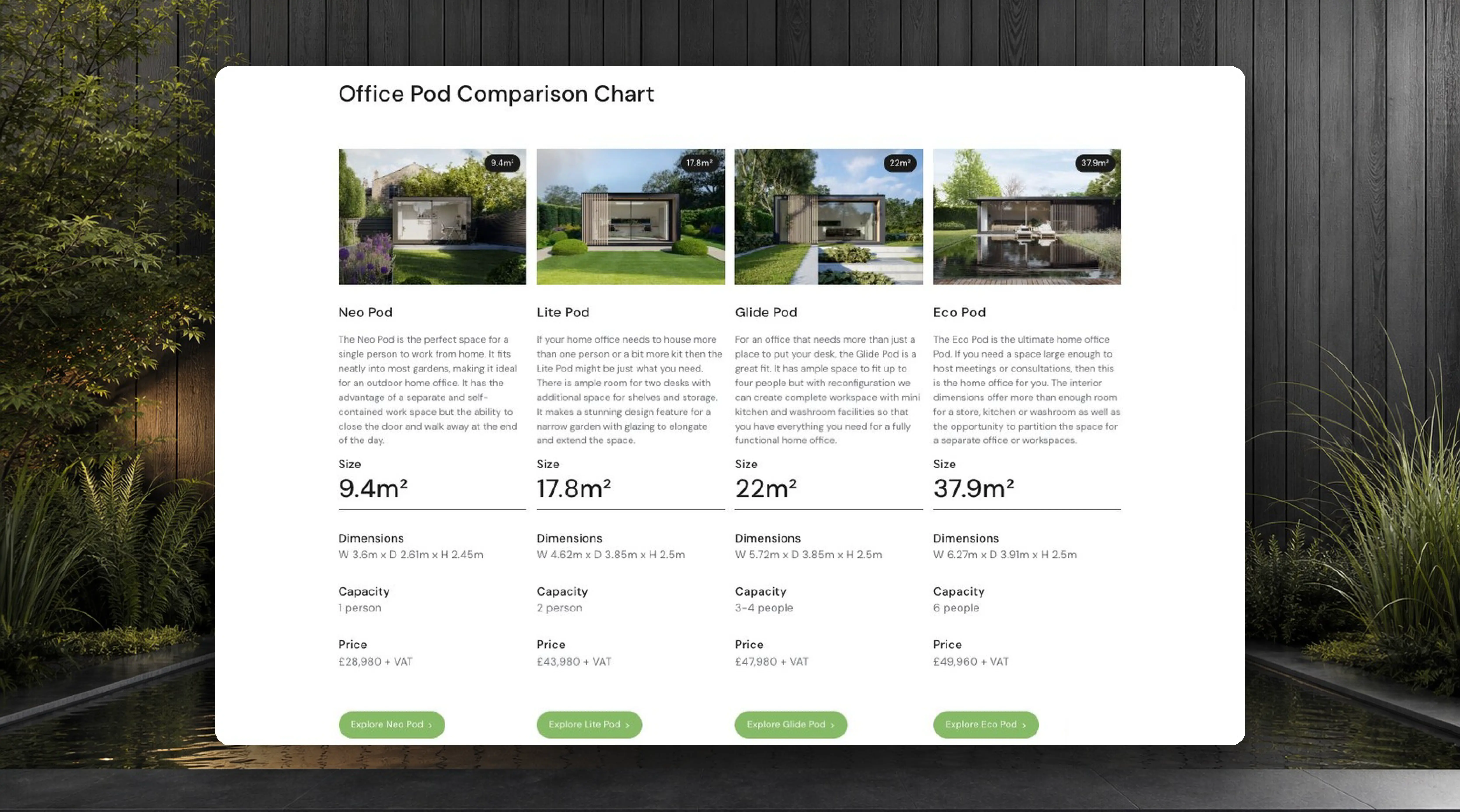
Comparison content and interactive brochures support customers who need more detail before making contact, building enough confidence for the right next conversation.
Building qualified interest beyond the website launch
The comparison chart and responsive product imagery shows the practical layer behind the brand presentation. Customers can explore differences, move between devices and reach information that supports a higher-value decision.
The new website became the centre of an ongoing programme. Technical and on-page SEO improved discoverability, while more than 150 marketing emails, interactive brochures and ongoing campaign creative kept the business visible throughout a longer consideration period.
Organic traffic increased by more than 35%, search visibility improved by 20% and the website generated more than 1,500 enquiries and brochure requests during the measured year.
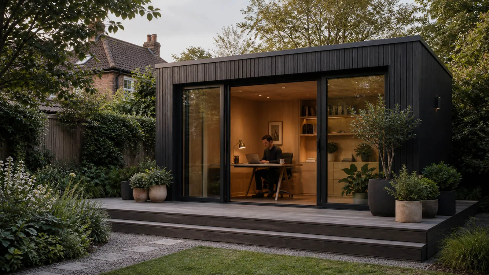
Buying a garden room isn’t an impulse decision, so the website has to do a lot of the selling before someone ever gets in touch. Our focus was on making the product feel easy to understand, showing the quality properly and giving people the confidence to take that next step.

If you’re looking for solutions to drive real growth, we’re the team that makes it happen.
.svg)
.svg)



















.svg)
.svg)

.svg)

